


In recent years, the blend of neon and neutral tones has gained traction in the design world. This bold yet balanced combination is making waves in both home decor and commercial spaces, offering a unique way to capture attention without overwhelming the senses. But why is this trend so important, and how does it benefit businesses?
The Appeal of Neon and Neutral
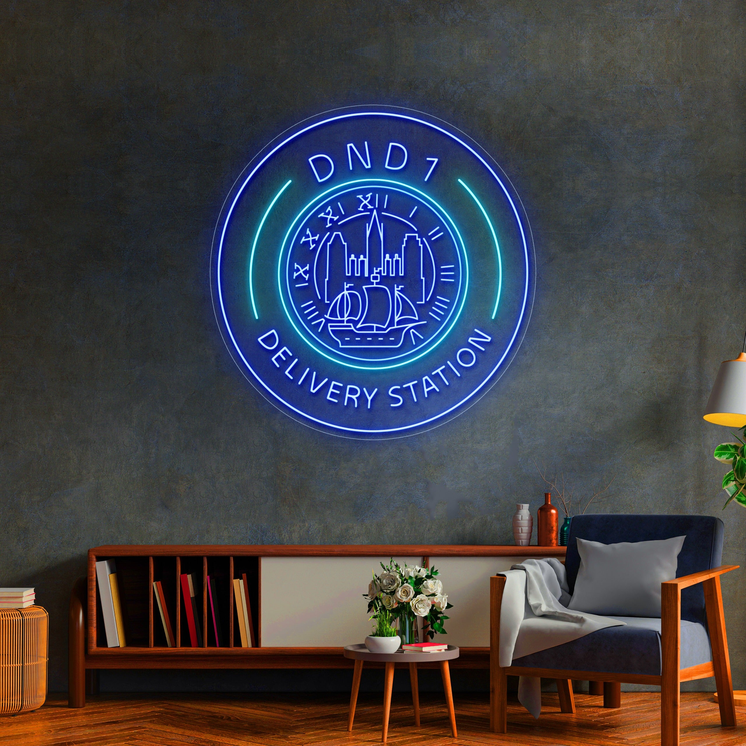
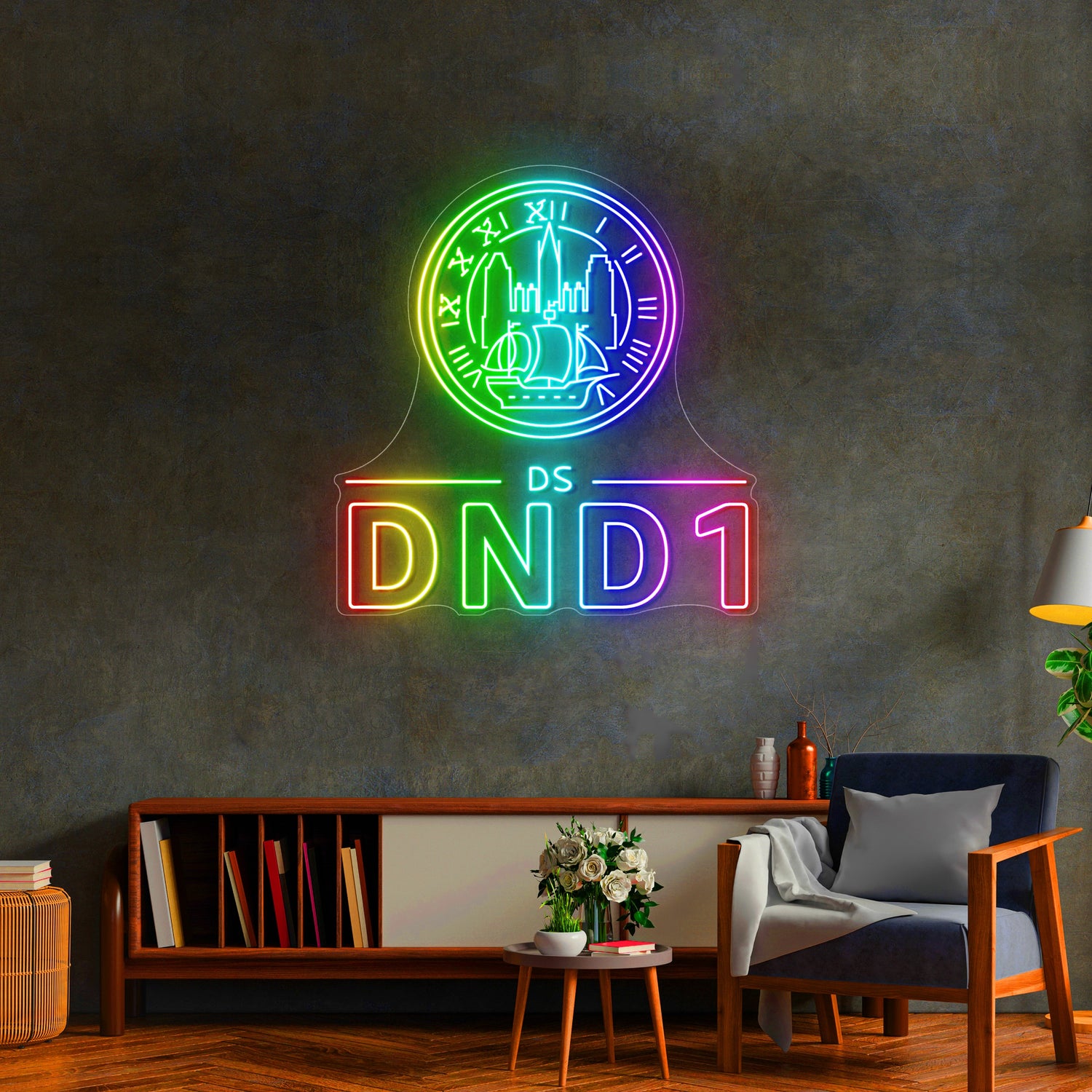
The juxtaposition of vibrant neon hues against soft, neutral backgrounds creates a striking visual impact. Neon adds energy and excitement, while neutral tones provide a calm, grounded contrast. This combination allows designers to create spaces that are both lively and sophisticated. Whether it's a pop of neon in a minimalist room or a strategic use of neutral tones to tone down neon signage, this pairing offers versatility that appeals to a wide range of tastes.

How Neon and Neutral Benefit Businesses
For businesses, incorporating neon and neutral into design schemes can be a game-changer. Neon elements naturally draw attention, making them ideal for signage, branding, and focal points. However, too much neon can overwhelm a space, which is where neutral tones come into play. Neutral shades help balance the vibrancy of neon, ensuring that the design remains professional and welcoming. This balance is crucial for businesses that want to stand out without appearing overly flashy.
For example, in retail stores, neon accents can highlight key products or areas without overwhelming customers. In restaurants, neon lighting can create a trendy, modern atmosphere, while neutral tones keep the space comfortable and inviting.
Tips for Using Neon and Neutral in Design
When integrating neon and neutral into your design, keep these tips in mind:
- Start Small : Begin with neon accents like signage, artwork, or lighting, paired with neutral walls or furniture.
- Choose a Focal Point : Use neon to highlight a specific area, ensuring that it doesn't overpower the space.
- Balance is Key : Keep the overall design cohesive by balancing bright neon with soft, neutral tones.
By combining the best of both worlds, you can create a design that feels fresh, modern, and accessible.
Why It Matters for Branding
Incorporating neon and neutral into a business's branding strategy is not just about aesthetics. It also sends a message. Neon signals creativity and energy, while neutral tones convey stability and professionalism. This dynamic combination can help businesses stand out in a crowded marketplace, appealing to both adventurous and conservative customers.
For example, companies like Luminary Design Studio have used neon accents in their branding to capture attention while maintaining a clean, neutral backdrop to keep the overall look professional and approachable. Another great example is Bright Spaces Interiors , which uses a combination of neon signage and neutral decor to create a welcoming yet energetic environment for clients.

The combination of neon and neutral is more than just a design trend—it's a powerful tool for businesses looking to create impactful, memorable spaces. By leveraging the vibrancy of neon with the calming influence of neutral tones, businesses can design environments that not only attract attention but also foster comfort and professionalism. Whether you're designing a new retail space, office, or restaurant, consider the neon and neutral duo to enhance your brand's image and customer experience.